- Visual Data Storytelling
- Posts
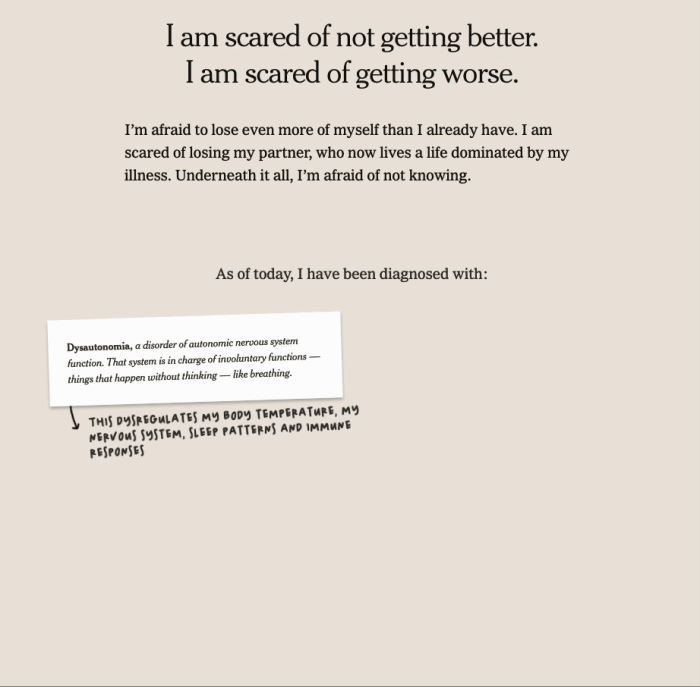
- My Life With Long Covid, by Giorgia Lupi
My Life With Long Covid, by Giorgia Lupi
Giorgia Lupi is the voice of data humanism, and has been a vocal advocate of finding visual ways to display our "messy lives". After three years of long covid, she explores her journey through pain, medical bills, and hope, in this very personal visual essay for the New-York Times.
Mathieu Guglielmino
December 18, 2023
Last week I mentioned Kandinsky’s artistic vision in a discussion with Munzner’s “Nested Blocks” model for visualization design. I pursue this discussion this week as Giorgia Lupi published her latest visual essay for The New-York Times.
Also, this digest and all the others are finally available on visualdatastorytelling.com, so check it out if you missed the previous issues!
Whenever Giorgia Lupi drops new work, it usually turns into the main event of the week. So when I saw the New-York Times published an opinion visual essay by the leading proponient of Data Humanism, I felt excited!
However, my enthusiasm waned when I realized this was not going to be an easy and light-hearted piece.
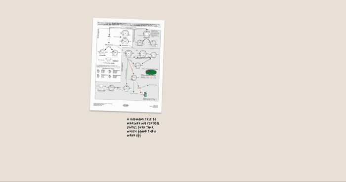
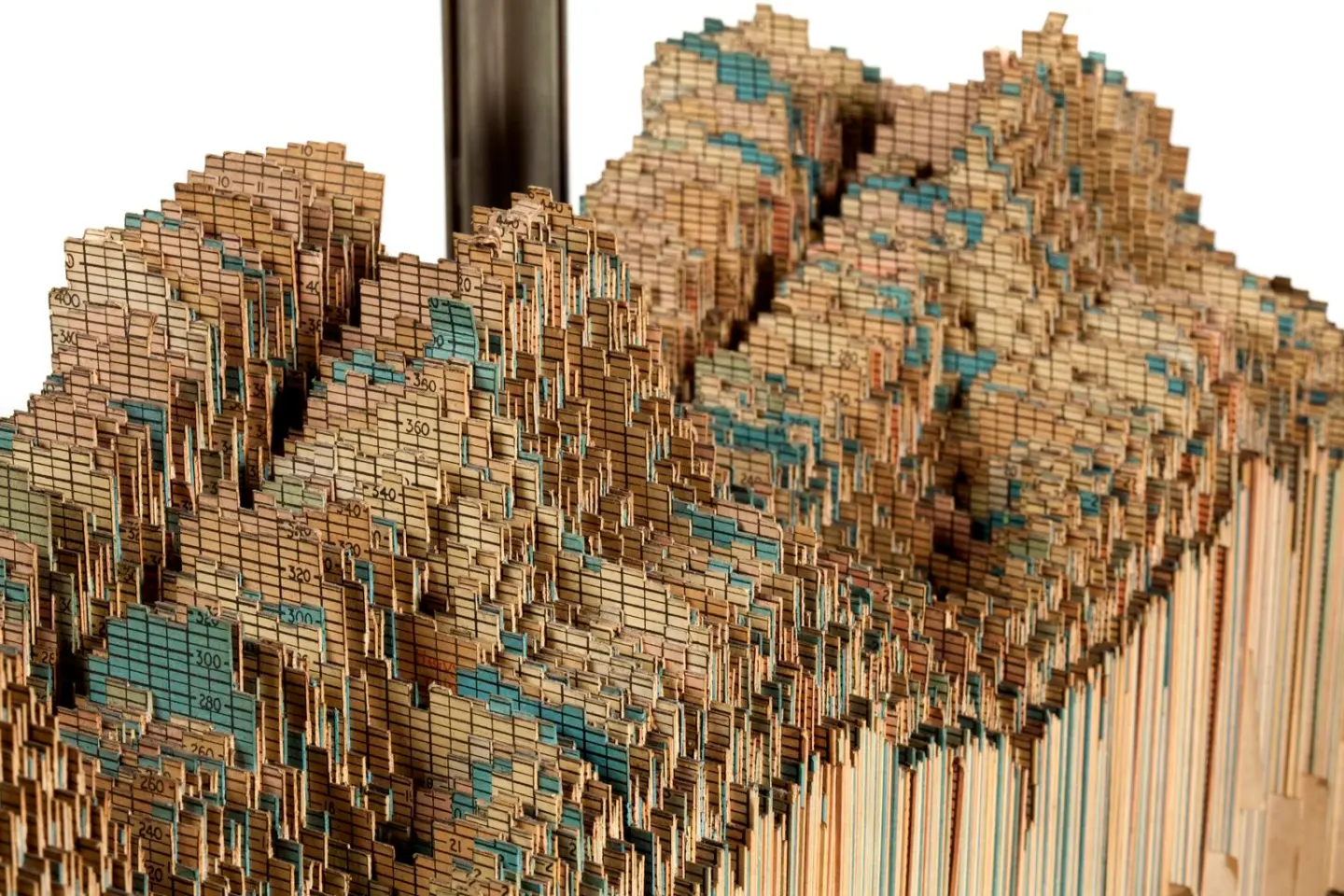
Giorgia Lupi suffered from more than 20 out of 200 symptoms identified with “long covid”. To reclaim the narrative and control over her own life, she did what she knows best, and crunched the numbers—medical bills, doctor appointments, blood tests, pain—all of these thoroughly recorded in a massive spreadsheet.
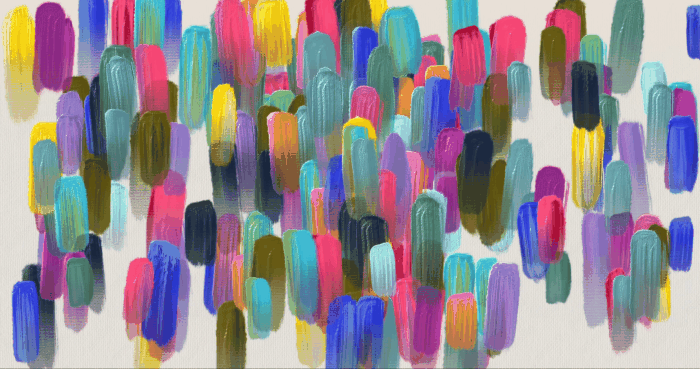
Lupi is an information designer, and she is used to visualize messy, complicated, often personal data. In this case, to best share the most significant event to happen in her life, she used brushstrokes. Fragile, colorful, abstract brushstrokes.
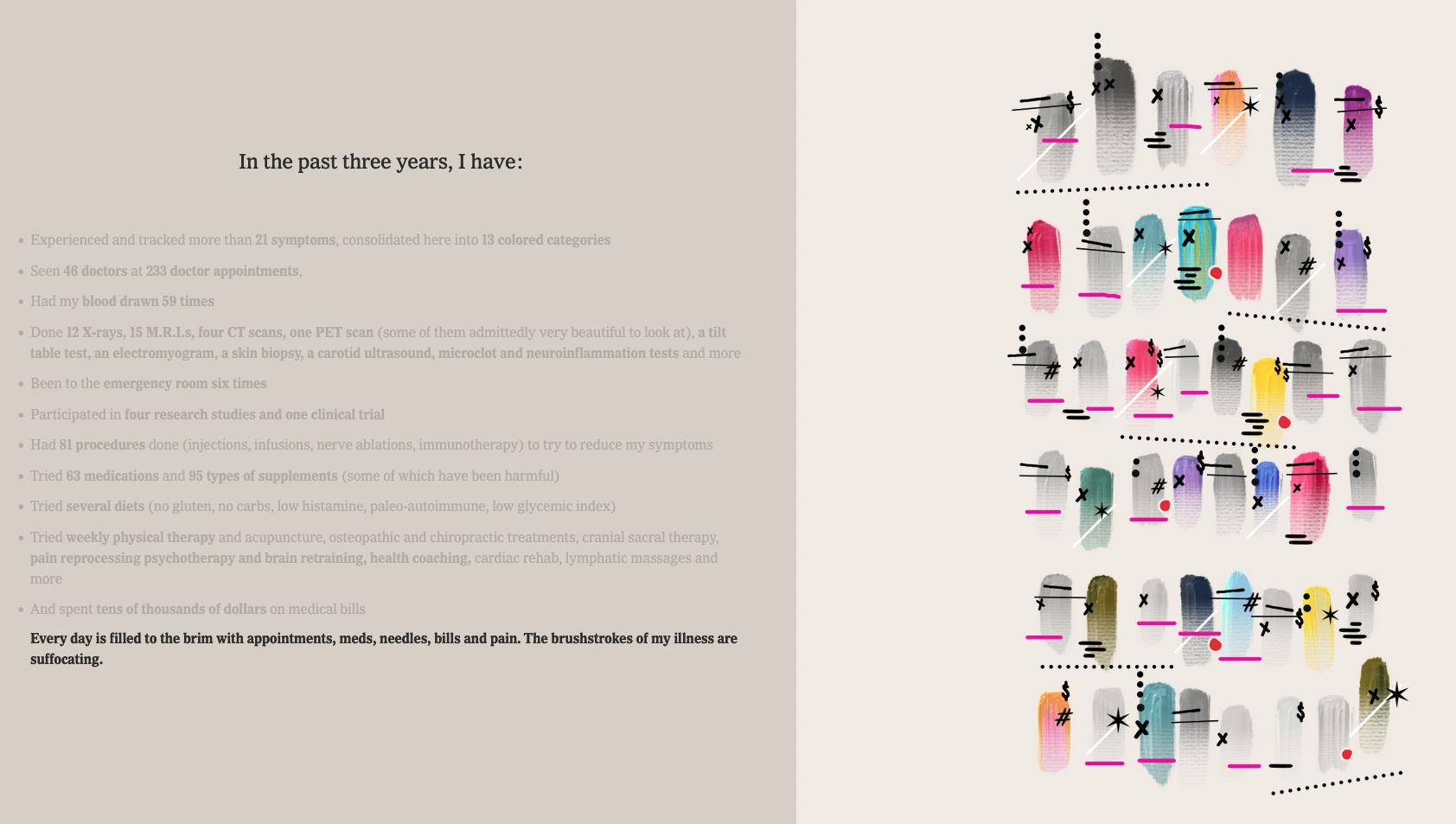
This results in an overwhelming painting of the overhead long covid put on her.
Every day is filled to the brim with appointments, meds, needles, bills and pain. The brushstrokes of my illness suffocating.
Brushstrokes are the main visual metaphor of this visual essay. Like an impressionist painter, Lupi brushes strokes of her illness on the canvas of our screens with her innermost voice.
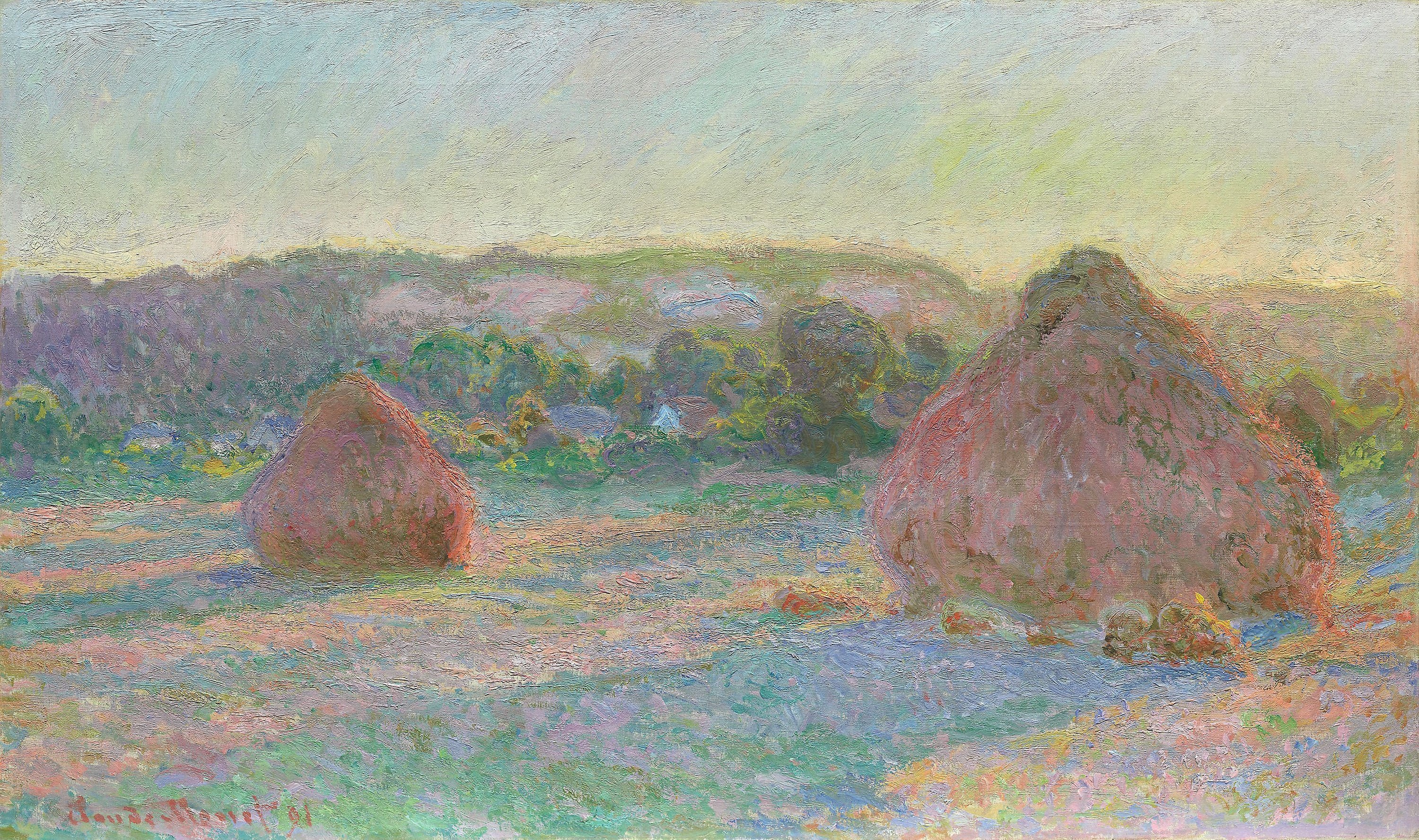
Claude Monet’s “Haystacks” (1890)
What Lupi must have been aiming with such a personal essay is to trigger a “vibration of the soul”, as called by Kandinsky in his influential essay “On the Spiritual in Art”.
As he recalled seeing Monet’s “Haystacks”, he could not identify the subject of the painting at first, got mad at the painter. But as it left a startling impression upon him, he came to realize there was more to art than mere representation of nature, and he led the 20th century into abstract expressionism with one ambition: find a visual language to express the innermost truth of the artist.
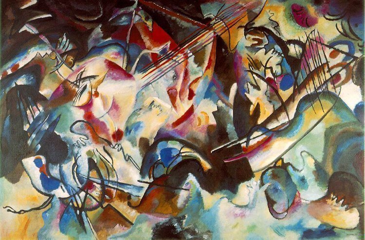
Composition VI—Wassily Kandinsky (1913)
Similarly, Lupi’s visual essay leaves an overwhelming feeling as are stacked pictures of documents, as well as strokes. The pictorial rhythm reaches a climax with the “year of pain”, violently blue.
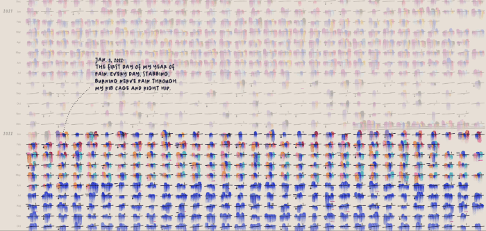
The “year of pain” is the visual climax of the story with a swarm of electric blue strokes.
Kandinsky recalled the goal of the artist was to find an innermost truth, by any means necessary. This truth, he writes, would not lie in the mere representation of nature, but in the inner quality of shapes and colors, this infinite material from which artists can derive all their art. For Kandinsky, the only way to be subjective and find such a language of truth was through a purely abstract art, unsoiled with mere representational goals.
Why did Giorgia Lupi chose brushstrokes to visualize her all-is-lost moment? The climactic electric blue brushstrokes of the “year of pain” paint a vivid picture of what her life has become, giving rhythm to the abstract, in an attempt to synchronize the outward with what is most intimate, the innermost truth she has to convey. Abstract shapes can also do that, beyond the realms of sanitized bar charts.
Design is industrial; art is hand-made. This too simplistic definition however emphasizes a crucial difference between expressing an innermost truth and only mimicking nature. This “alive language” both Lupi and Fragapane came up with is not
What we have come to think of as a line with abstract and organic lying at end of it is actually a circle, and the two ends meet when the goal is to find an innermost truth.
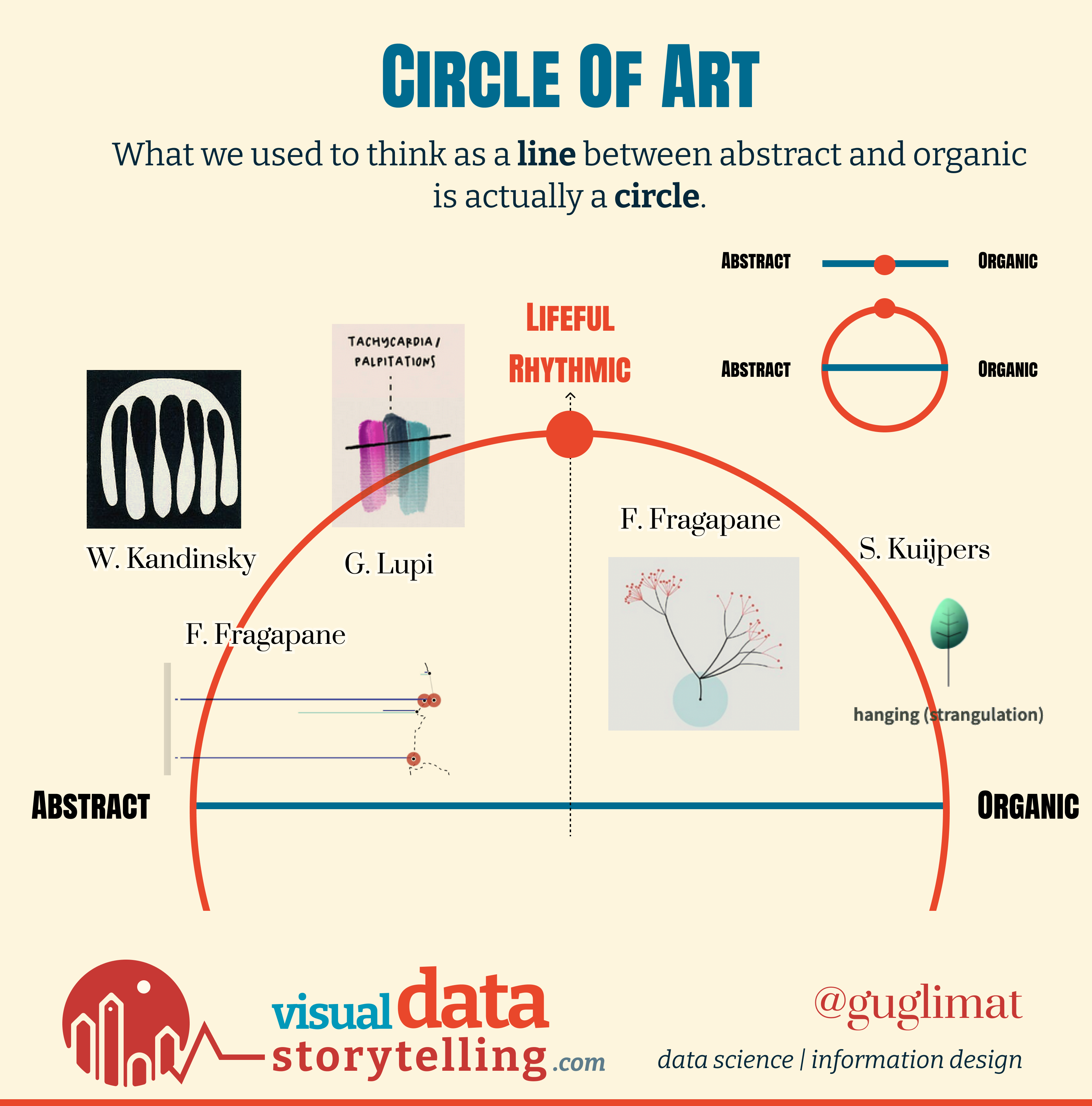
Life-like shapes are more likely to be rhythmical, because nature by itself creates interesting visual rhythms. On the other hand, abstract shapes are dull when arranged on a grid. Finding this rhythm, this “vibration” as would say Kandinsky, is the job of the artist.
The distinction between lifeful and lifeless is not one between abstract and organic, but between rhythmic and static. Both Fragapane and Lupi have explored these extreme sides of the spectrum, but their works always are full of life and rhythmical, even when using abstract shapes.
This section sometimes comes with a surprise, as is the case with the “World Energy Outlook 2023”:
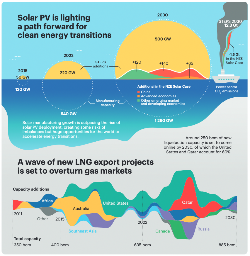
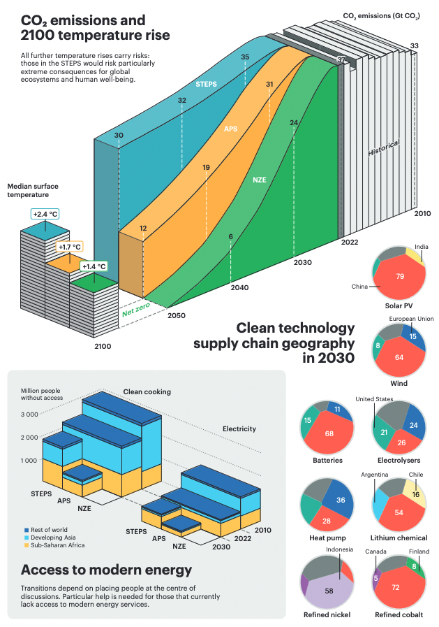
It is most unusual for an official report such as this one to step away from conventional charts. As a result, the cognitive burden here may be too heavy for the reader.
However, I find the charts playful and they made me want to engage with them. I love the visual metaphor of the sun over the sea for photovoltaic energy. Even the use of 3D, somehow unjustified here, I judge not so harshly seeing how it made me think about historical energy viz:
Three-dimensional chart used by Central Electricity Generating Board, c.1954. (Science Museum Group)
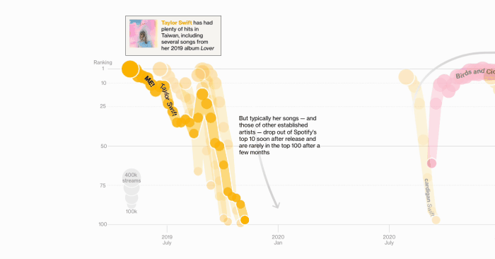
An animated rankchart about TikTok top hit in Bloomberg. By Betty Hou, Spe Chen, and Argin Chang.
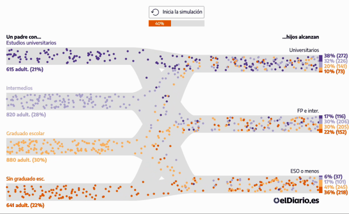
A simulation of the social elevator, in El Diaro. By Raúl Sánchez, Victòria Oliveres, Ainhoa Díez.
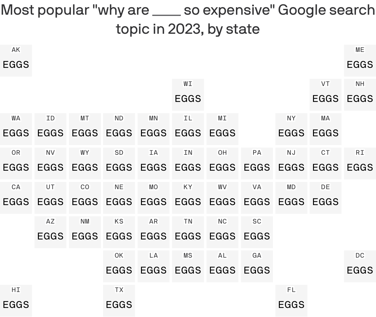
A genius map about inflation in Axios (by Jacque Schrag)
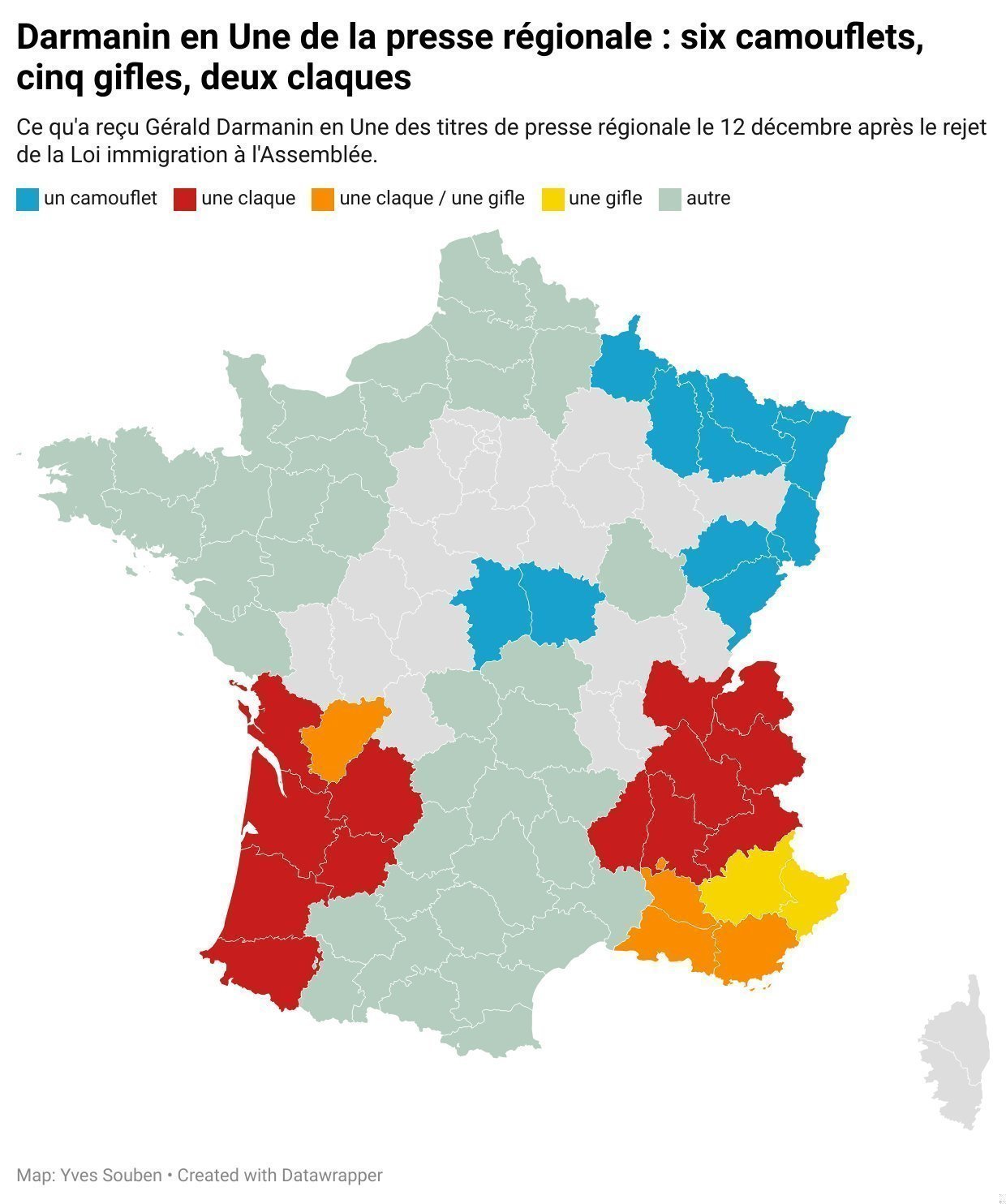
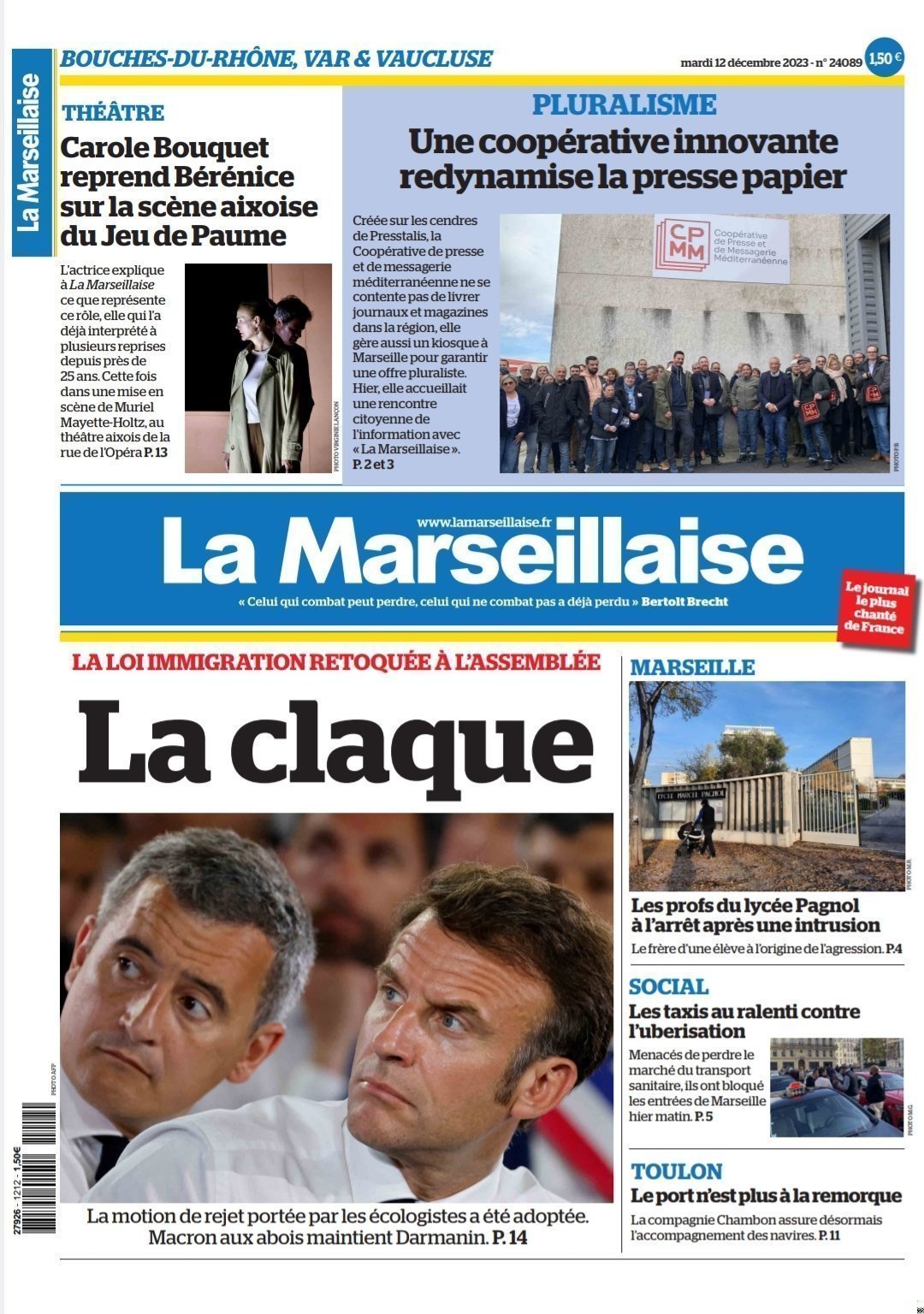
Last week in a surprise vote French parliament rejected the most-anticipated immigration bill of the government. This came as a humiliating and personal defeat for Gérald Darmanin, French Interior Minister and front-runner in the next presidential election to succeed Emmanuel Macron.
What type of slap did Darminin received? The answer in this brilliant map by Yves Souben:
See you next week,
Mathieu
Reply