- Visual Data Storytelling
- Posts
- [VDS] Causation, Simulations, Simpson's Paradox
[VDS] Causation, Simulations, Simpson's Paradox
This is the third installment of a reflection about games in humanistic data storytelling. It will focus on causal models and simulations.
Mathieu Guglielmino
February 14, 2024
This week’s more of an interlude about causation and simulations, as I will delve into writing a small visual simulator in two weeks.
Games and Visual Epistemology
Humanistic values generally acknowledge the subjectivity of human experience, and the interpretative nature of knowledge. While science has successfully mathematized an objectified world, humanities recognize knowledge can only be at times statistical, and most often is derived, or concerned, with interpretation.
If this were to translate into a visual epistemology, this would mean to find the sweet intersection of humanistic, hence subjective and co-dependent, and scientific concepts of knowledge.
As I was reflecting about a way to include such subjective knowledge into information design, I remarked the Bayesian framework of causation was well suited to this goal, and could be explicitly linked to simulated systems, which is a big part of what games are.
Simpson’s Paradox, or the Limits of Statistics
The limits of statistics are acknowledged by statisticians themselves, and one such trumpeting example is Simpson’s paradox.
To illustrate it, let us take a look at the results of a drug study (table 1.1), segregated by gender.
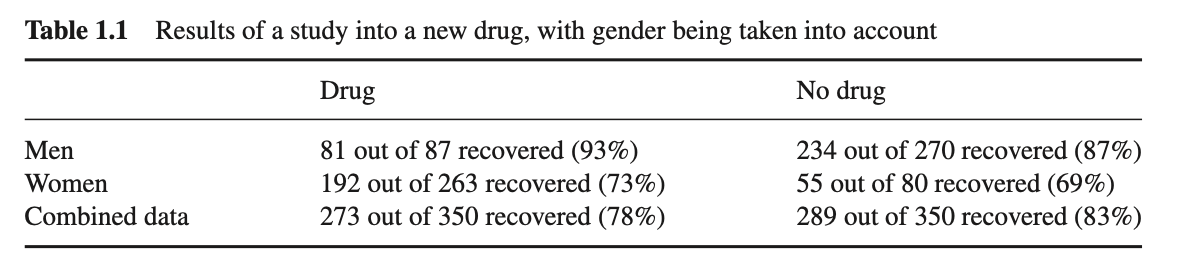
From “Causal inference in statistics, a primer” (Judea Pearl, 2016)
How could it be that taking a drug harms the general population (78% < 83%), but at the same time seems to be beneficial to both men and women? Should you prescribe the drug only if you don’t know the patient’s gender? This seems counterintuitive, because it’s wrong.
Another example, using the exact same numbers, but this time taking blood pressure (BP) into account (table 1.2):
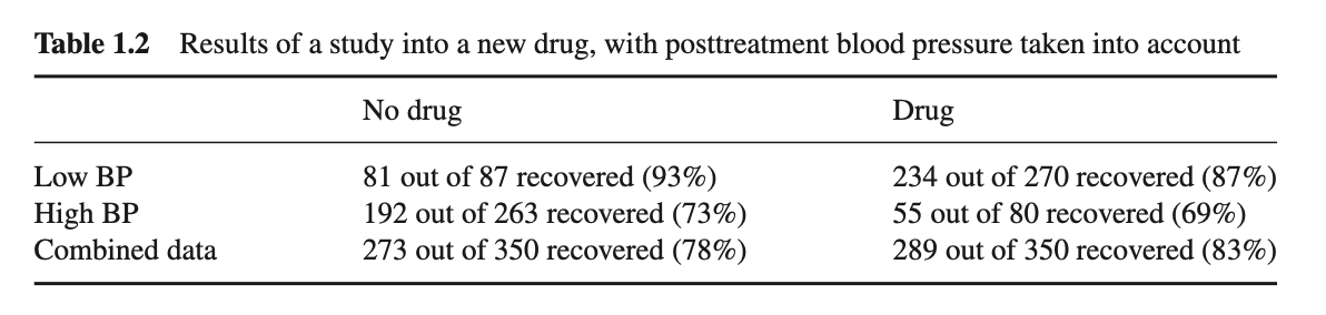
These two situations, while described by the same dataset, actually differ in how the data is generated, and the conclusions are remarkably reversed:
in the first case, women are more likely to take the drug, so if we select a user at random, the person is more likely to be a woman, and less likely to recover. Being a woman is both a cause of drug taking and failure to recover ;
in the second example, lowering blood pressure is one of the mechanisms by the which treatment affects recovery, so it would be ill-advised to separate the results based on blood pressure.
In the first case the correct interpretation lies in the segregated data by gender, while the latter needs the aggregate data.
Named after Edward Simpson (born 1922), this paradox refers to the existence of data in which a statistical association that holds for an entire population is reversed in every sub-population.
As statistics are blind to the causal story behind the data, they are also unable to answer this paradox in a satisfying way.
The Ladder of Causation
Best-selling author of “The Book of Why”, Judea Pearl is professor of Computer Science at UCLA (Los Angeles). His work focuses on causation, or how to represent this elusive concept in mathematical terms.
Especially noticeable is Pearl’s contribution to the development of “graphical models” to represent knowledge about causation.
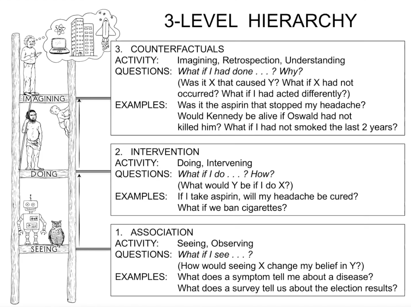
The Ladder of Causation (The Book of Why, Judea Pearl)
Most questions we can ask about causation won’t be answered by the data themselves, as we saw with Simpson’s paradox.
We study causation because we need to make sense of data, to guide actions and policies, and to learn from our success and failures.
However, it is possible to visually represent the chains of causation as cascading random variables that influence each other. This extra-statistical knowledge can express the causes of events with the natural language of uncertainty: probabilities.
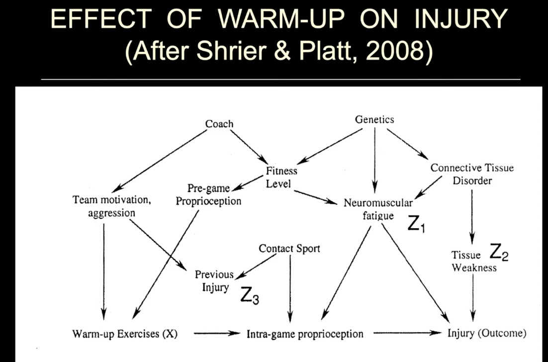
The effect of warm-up on injury (after Shrier & Platt, 2008)
Structural Causal Models (SCMs)
The aim of statistical techniques is to describe the data, but never the process responsible for it. This implicit (and false) assumption that “data” are created ex-nihilo from a Platonist ideal world is dangerous, and we would be better advised to use term capta.
Words, words, words.
Causal models represent the “causal story” underlying data, or the mechanism by which data were generated. They are also called “graphical models”, not because they can be visually represented (which they can), but because they rely on an ubiquitous mathematical construct: graphs.
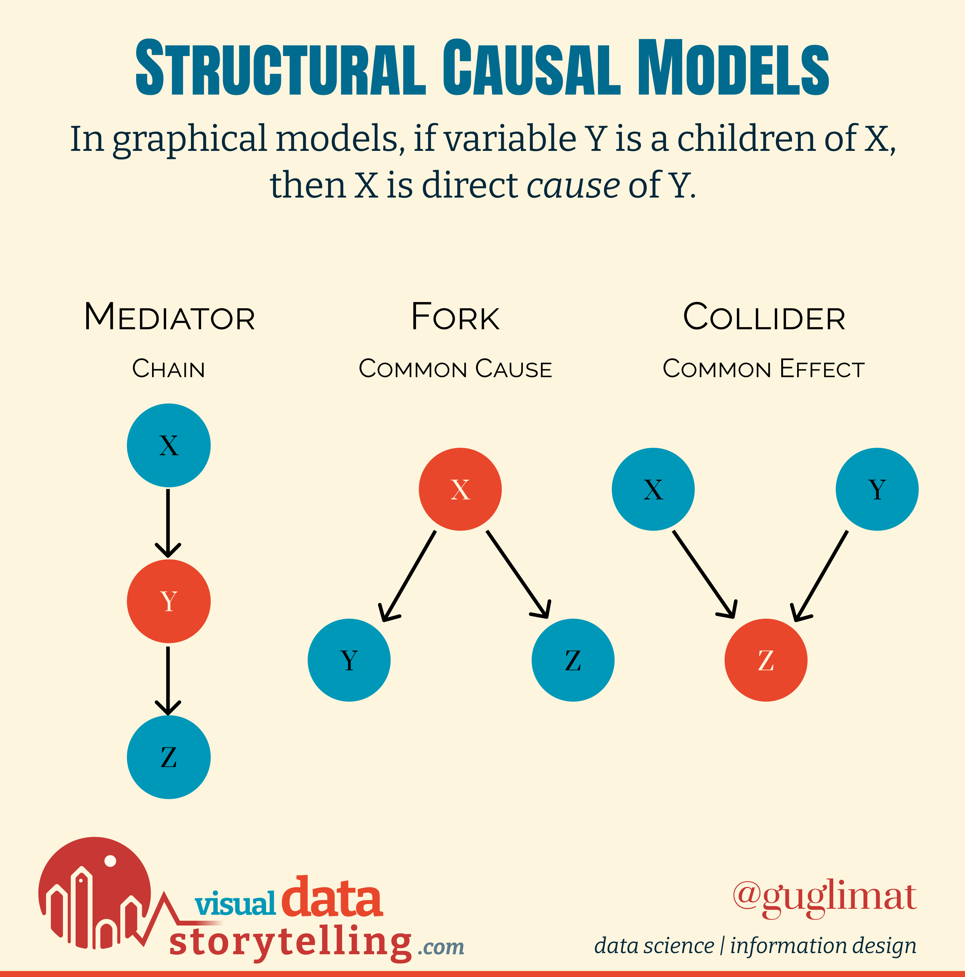
Structural Causal Models (SCMs) can be defined rigorously using the language of probabilities in a Bayesian framework, with connections between nodes indicating non-independent random variables. Depending on incoming or outgoing edges, a node may be a mediator (in a chain), a fork (a common cause), or a collider (a common effect).
One particular and useful type of models are Directed Acyclic Graphs (DAGs), with no loop.
From Causal Inference to Simulation
It is interesting to note how similar the framing of causal inference is to simulation, especially used to study complex systems dynamics.
The two disciplines share some similar goals:
handle uncertainty,
what-if scenarios,
risk-free environment.

AnyLogic is a historical player of systems simulation
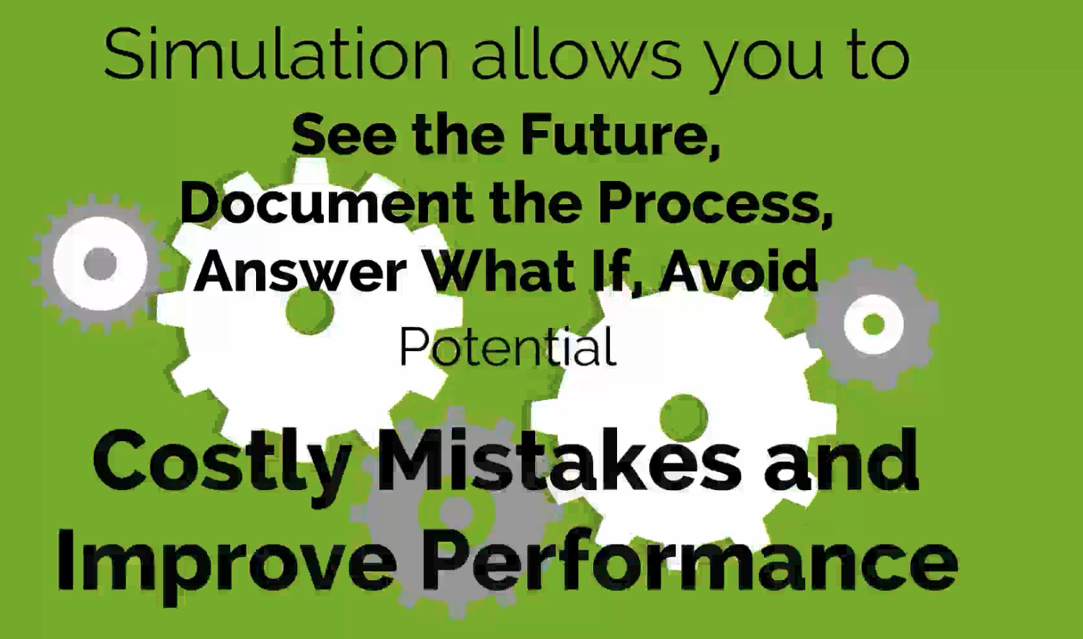
Simio (SImulation Modeling framework based on Intelligent Objects) simulates complex system (promotional content)
A Visual Language of Simulated Systems
Both AnyLogic or Simio have their own visual language to express the dynamics of complex systems, in the forms of graphs:
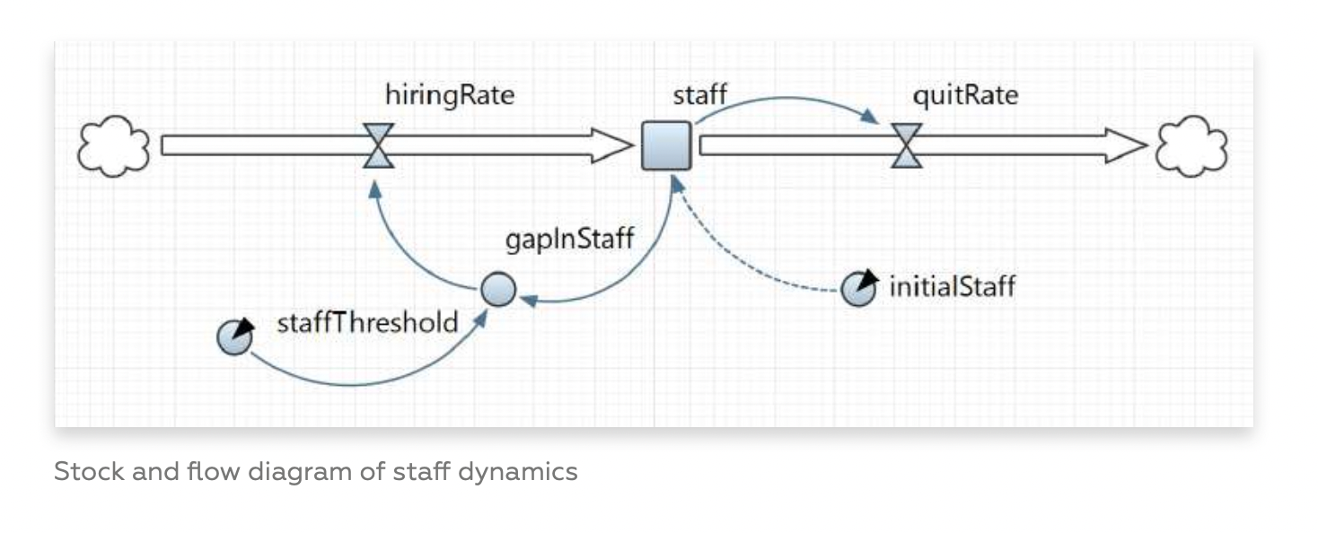
Graphs have been used recently with great success because of their expressive power.
When I say graph in this context, I refer to the mathematical concept of nodes and links, though the term is sometimes interchangeably used in place of charts.
The game mechanics from part II (play “Mother of Inequalities”) can be modeled and simulated with the machinations framework as a node-edge diagram.

“Machinations” is an expressive framework for game design. See part II for a primer on the topic.
These chains of causation, from wealth, cultural capital, or active segregation, to the outcome of going to college or not, define the sampling process of the data that can then be visualized.
In “Mother of Inequalities”, the player may be prompted to take decisions about the current student (such as buy books or study Latin), who may in turn go to college or drop out.
The Expressive Power of Graphs
Game design, with the expressive “machinations” framework, or simulated systems, with the proprietary software of AnyLogic or Simio, and Structural Causal Models all aim to represent with graphs the complex dynamics of real-world systems.
In the previous settlement of this series, I was wondering if we could attach a model to a visualization:
information design represents the state of a system,
causal models represent the causal story underlying data, or the mechanism by which data were generated
In the previous case about inequalities, a simple causal model that could be overlaid upon the visualization is the following:
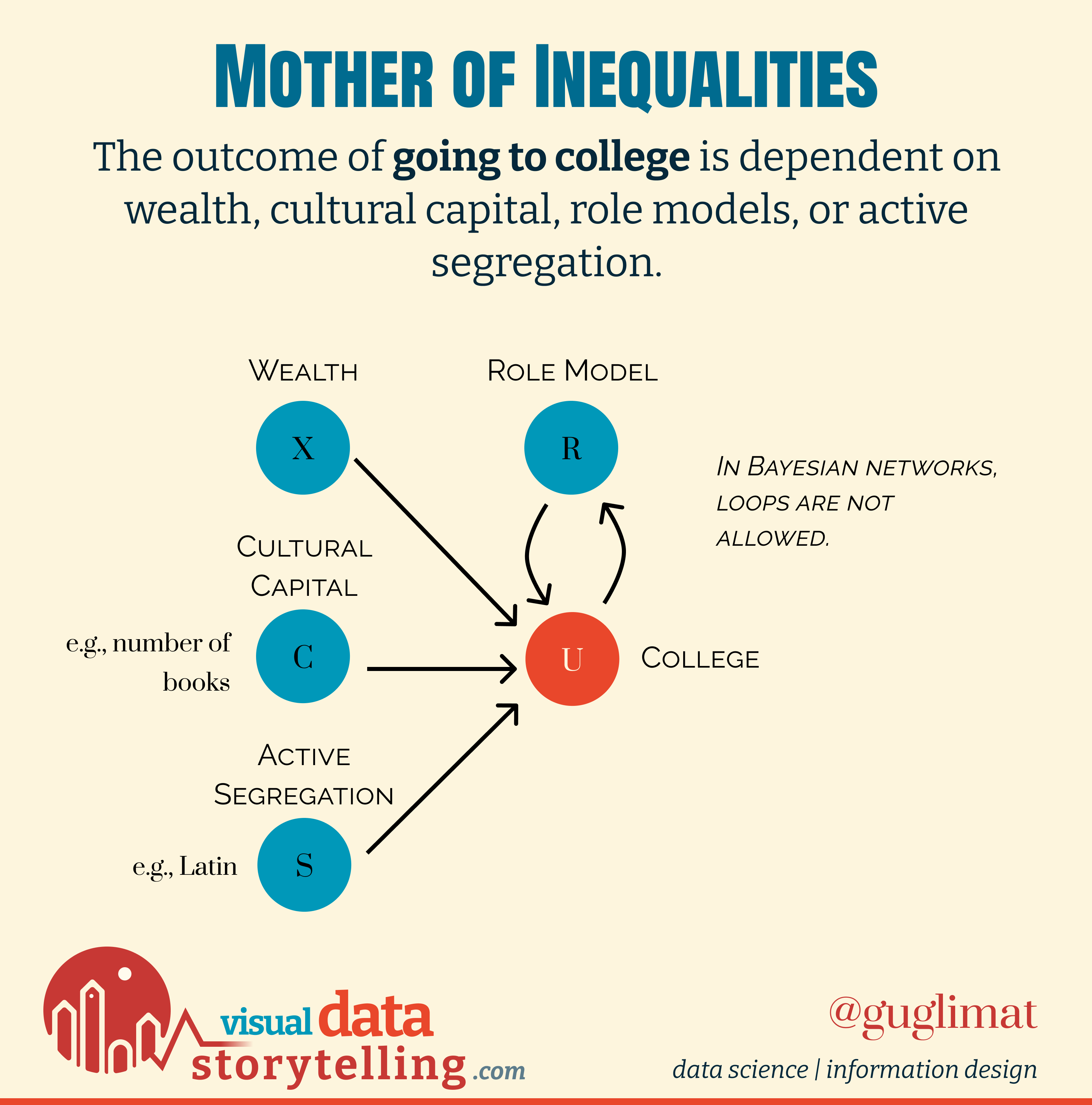
These relations define the internal workings of the system (in this case, the sampling), and can be altered by player input.
Networks As A General Pattern Language
Design Patterns are typical solutions to commonly occurring problems, and have met growing interest in software design, game design, architecture, UX design, storytelling, information design… You name it.
It is common in design to think of Christopher Alexander as the initiator of design patterns with “A Pattern Language” (1977), a collection of patterns in architecture, to answer such questions as to what makes a successful promenade (and is present in the official reading list of The Sims):
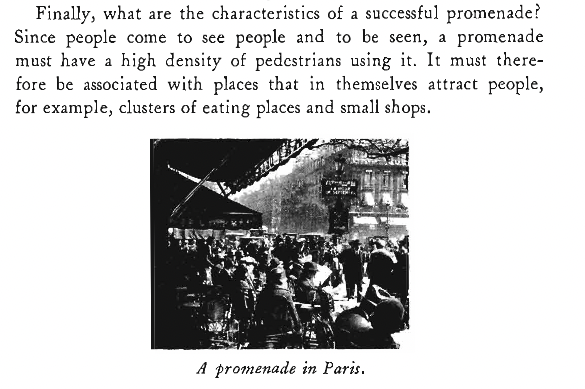
To be successful, a promenade needs be in 19th century Paris
Since Alexander, design patterns have been successfully used in a variety of fields, the most prominent being software design patterns and “The Gang of Four”, and we can but notice how common it is to express such patterns as graphs, or node-edge diagrams. Symbolic representation is key to the advancement of scientific knowledge.
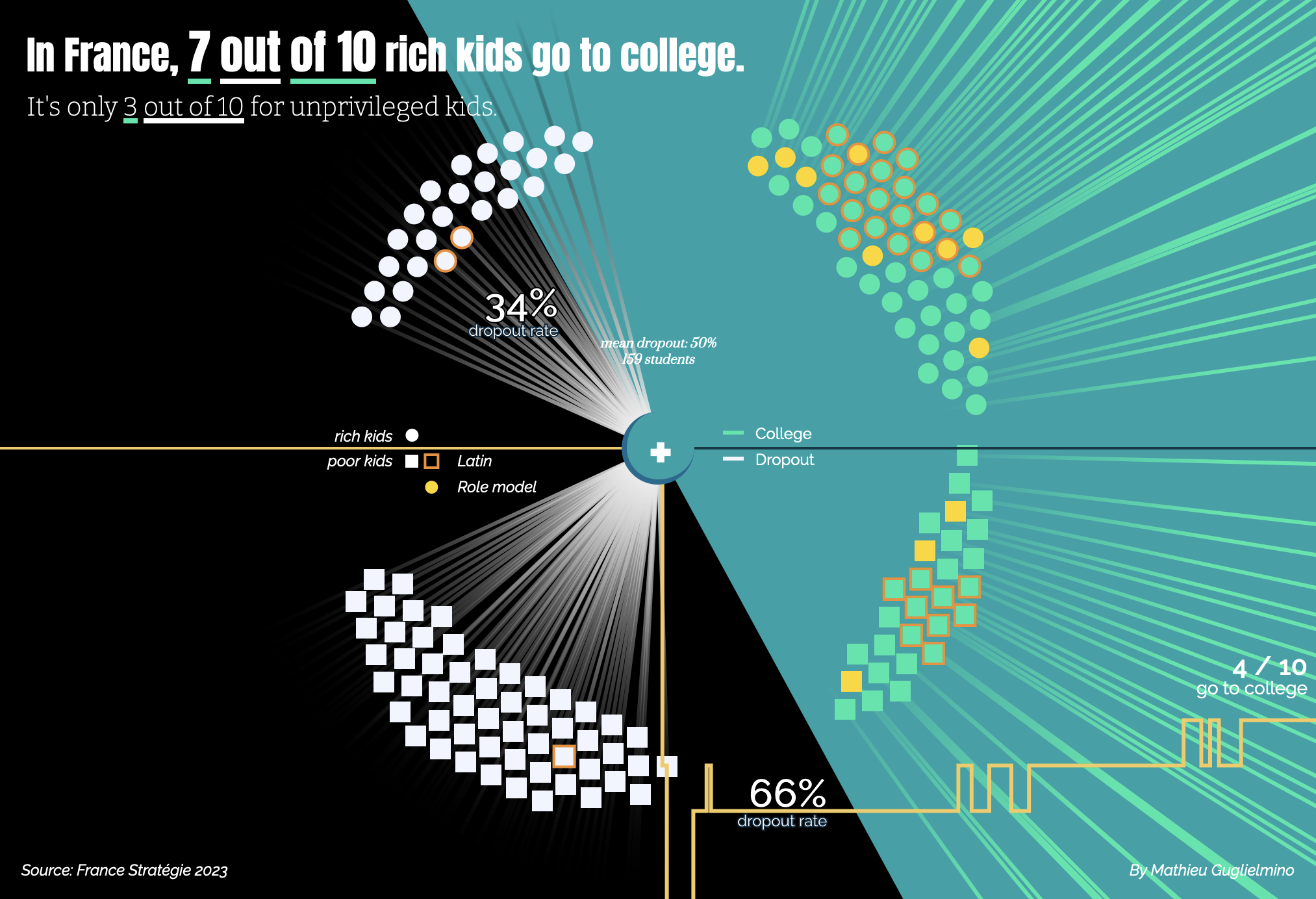
However, graphs are known to be hard to visualize above a few dozen nodes, and causal inference suffers from this problem when there are many random variables to take into account:
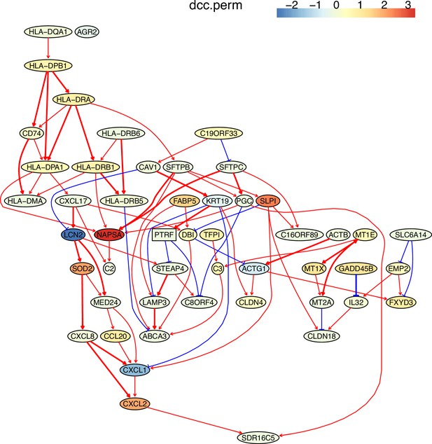
Causal inference to single cell analysis
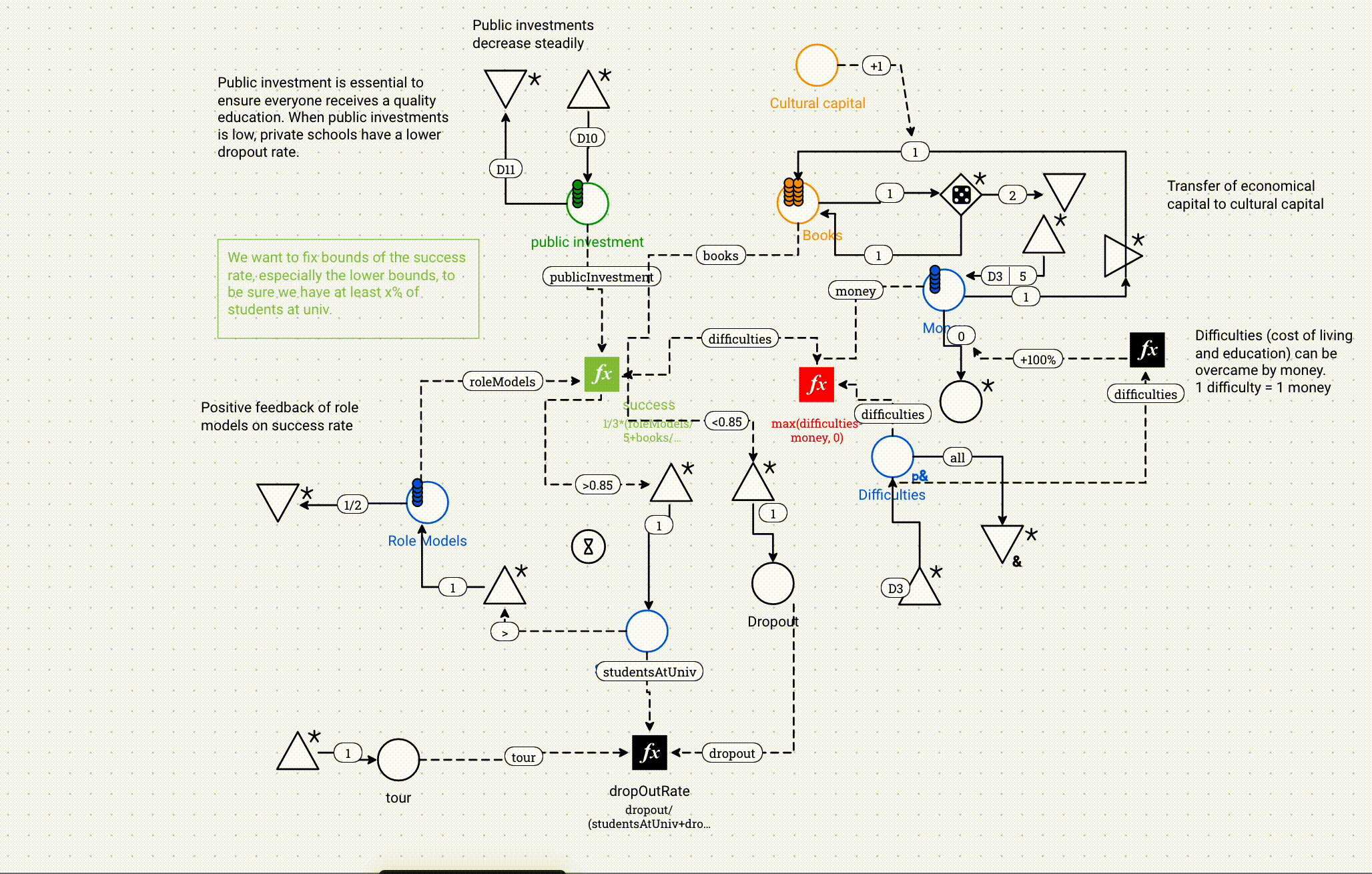
A more realistic and complex example about disparity in dropout rates before college
There is no free lunch, and adding graphical causal models over data viz may result in cluttered information for complex systems.
But can we try?
What’s Next
My goal for the next two weeks is to develop a general simulator based on graphical models, to generate data which can in turn be iteratively visualized with traditional infoviz.
Since it is still a bit too soon for me to share any work-in-progress, the only remaining thing for me to say to you is:
À la semaine prochaine,
Mathieu
Reply