- Visual Data Storytelling
- Posts
- [VDS Quest Chart] Introducing Quest Charts
[VDS Quest Chart] Introducing Quest Charts
Quest charts are a paradigm shift in dataviz in which the reader-player can feel the data.
Mathieu Guglielmino
January 15, 2024
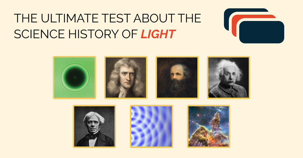
To write a history of light is to write a history of all science.
This all too common everyday life phenomenon that is light fed countless religious debates, scientific feuds, philosophical crisis, and ultimately advanced human knowledge to its very own tolerable limits.
Galileo birthed the Scientific Revolution when he observed Jupiter’s moons with a telescope, providing solid ground for the Copernician theory (and severe retaliation by the Church),
Newton overthrew more than 1,500 years of wrong beliefs about colors when he separated white light into colored rays through a glass prism,
Maxwell, after centuries of converging efforts, realize electricity, magnetism, and light are actually the same goddamn thing,
Young dethroned two centuries of Newtonian corpuscular theory when he had light interfere in his iconic double-slit experiment, hereby reinstating Huygens’ wave-theory of light—Newton’s unfortunate challenger at the time,
Einstein said everyone was right after all and, yes, even Newton, when he demonstrated light is actually both wave and matter, but actually not really Newton because Newtonian mechanics is less precise than general relativity and we know this because of an expedition to observe a solar eclipse,
Aspect proved in his Nobel experience about quantum entanglement that Einstein was wrong and Niels Bohr was right about the interpretation of quantum mechanics—that God does indeed play dice,
…
And now we know pretty much everything, except for small things and big things (and fast things, hot things, cold things…), which we are late to unify in a grand theory of everything.
You want to know more about this fascinating story of human knowledge? Just play the game!

“Timeline” was developed using Svelte, and I’m quite content with the smooth result!
Games are among the oldest human activities, and are a cornerstone of our learning process,
Games can last a few seconds, hours, or days, they can be played alone or with thousands of players, inside or outside, in a competitive or collaborative way,
Games can be the promise of something huge, like the concept of “newsgames” in 2010, but also of great demise, like “newsgames” in 2020,
Games can be a very persuasive rhetorical device, called procedural rhetoric,
Games are explorable simulations of the world.
As a consequence, and resolution for 2024, I will share here every other week in place of the traditional digest the results of my attempts to create quest charts.
But what are quest charts, exactly?
Quest charts are playable dataviz.
It is the consequences of this definition I’ll explore in the next following weeks, starting with the humanistic values of games.
A quest chart is a visual representation and interactive tool that shifts the principles of data visualization to humanistic values:
no reality, but experiences of reality,
Where data viz shows reality as one big aggregated abstraction, quest charts highlights
individual trajectories,
data is uncertain,
Where data viz focuses on what is, quest charts focus on
uncertain outcomes,
humans are situated,
Where dataviz pretends the data is neutral, quest charts emphasize that
no data precedes its capture,
knowledge is iterative and co-constructed,
Where data viz is a top-down process, quest charts have a
bottom-up approach.
emotions are valid,
Where data visualizations numb us with numbers, quest charts aim for
a visceral response,
impact comes from repetition
Where data viz is a slice of present consumed just once in a few seconds, quest charts are
repeatable statements that unravel in time, each time different,
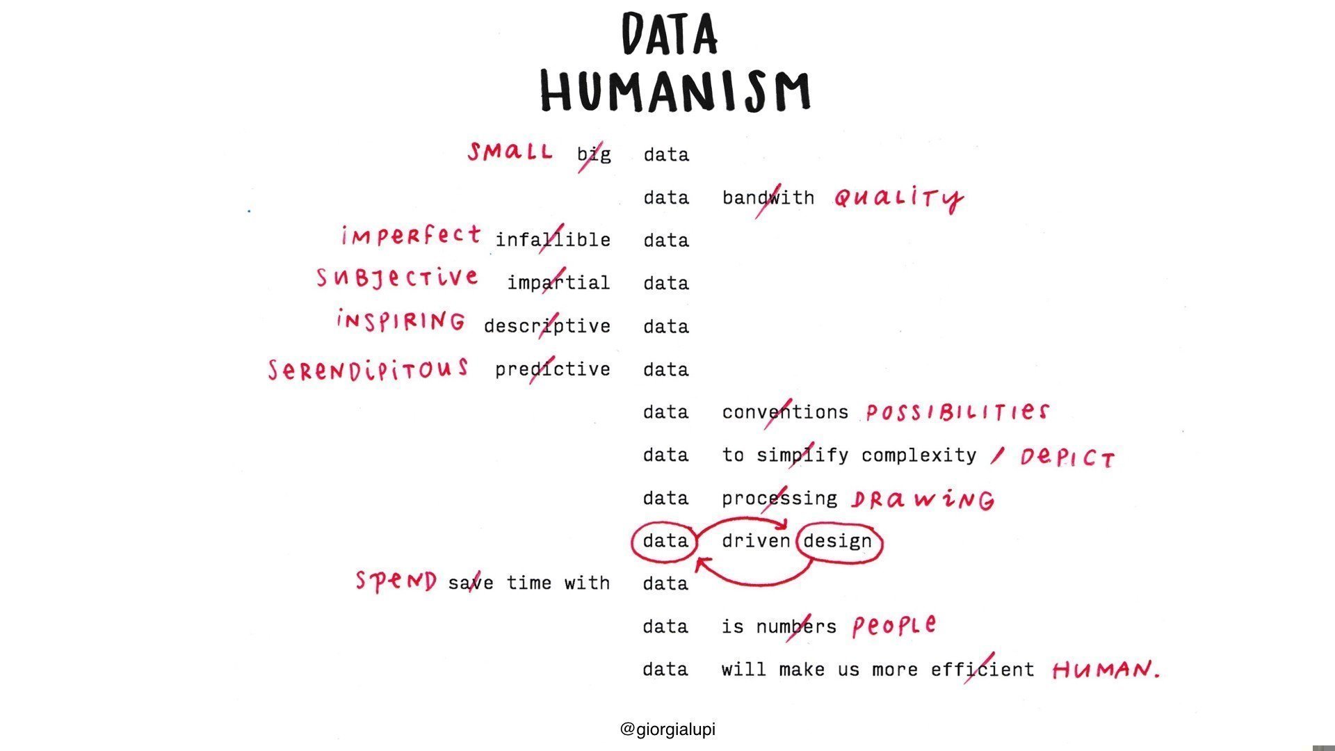
Giorgia Lupi’s “Data Humanism” manifesto
Let’s go back to the timeline of light one second. To be a quest chart, it should have humanistic values:
experienced: it takes time to go through the drag and drop before moving to the next event,
uncertain: the order in which the events are shown can dramatically alter the game,
situated: the closer the player get from my source of knowledge (modern European times), the harder it gets with more events to place on a shorter period,
co-constructed: the player leaves the mark of their mistakes on the final data,
emotive: the “correct / incorrect” feedback triggers positive or negative emotions,
repeated: events are selected randomly so you want to play again to find out about the ones you missed
This seems like a reasonable set of requirements for quest charts to be engaging and impactful, although being charts do not appear that essential in the end.
I didn’t realize until last minute what a great fit this game was to my design requirements.
At its core, the “timeline” game, or “flashback” as seen in the New-York Times, is an abstract design pattern to experience the distribution of a (temporal) dataset and update knowledge on one dimension (time), with a simple drag and drop interaction.
I see two differences between my version and the version upon which it is greatly ripped inspired from, in the New-York Times:
The NYTimes events are not thematically grouped, so you are testing your knowledge about unrelated events,
If you play the same game again you get the same events, but you can play a new game with new events each week.
However, they both serve common goals to engage readers (the NYTimes links to related articles) and update knowledge.
Quest charts is a concept that seems to be around for some time now with various names, but ultimately hasn’t delivered when it was tried out for data storytelling, like “newsgames” in 2010s.
However, they failed for the reason they didn’t bear any humanistic values in the first place, which to some extent are essential to games. The lack of it made them lifeless, dull objects.
It has been said the problem with game development is that it’s just too time consuming, and yes it’s near impossible to develop 3D computer games in a high-paced context.
Simple but meaningful interactions are the most important part of games, not graphics. But in order to create diverse outcomes, a simple interaction should live in a random environment.
How random is the message.
What do you think about it?
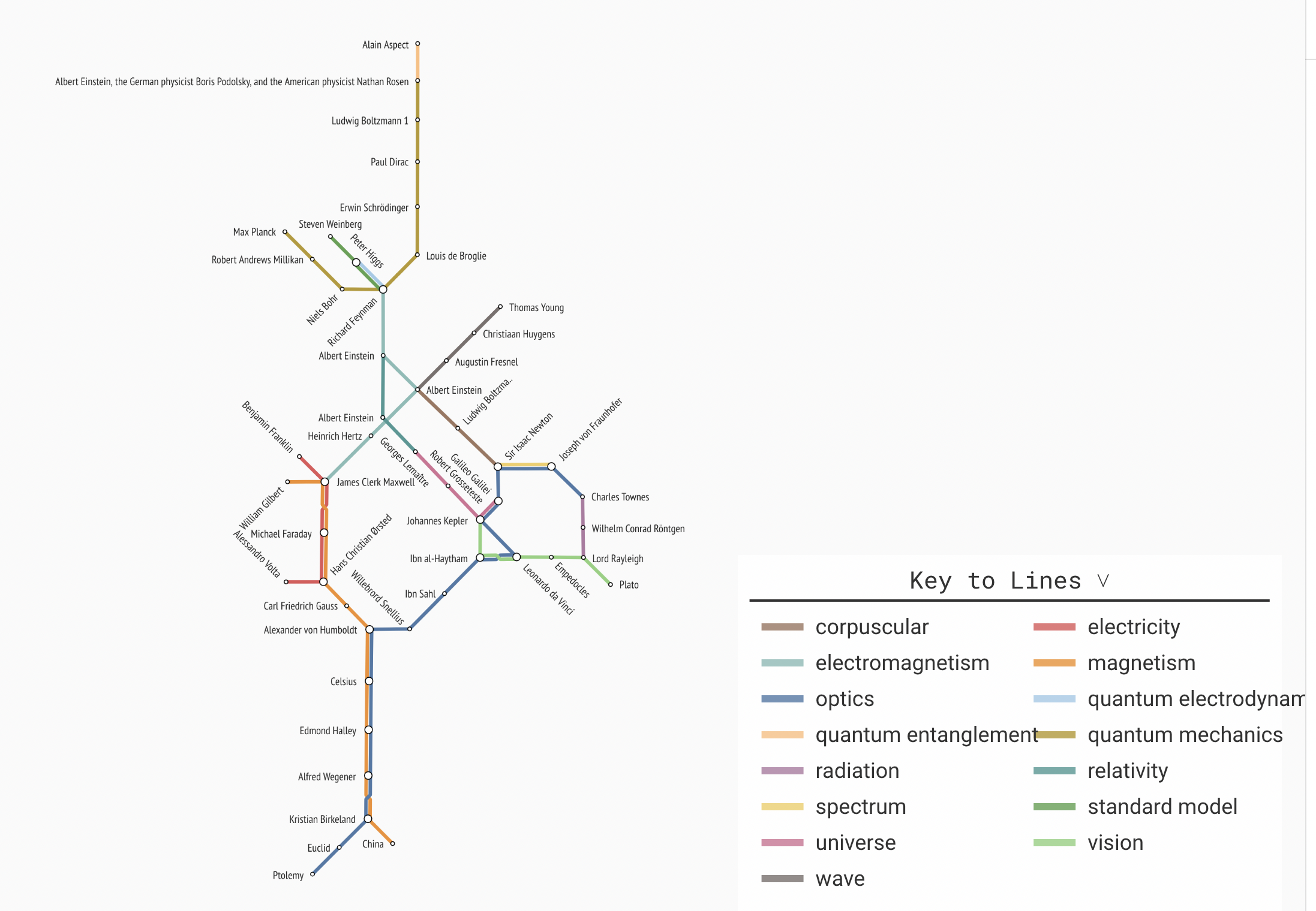
Some early attempt using a metro map visual metaphors on sets:
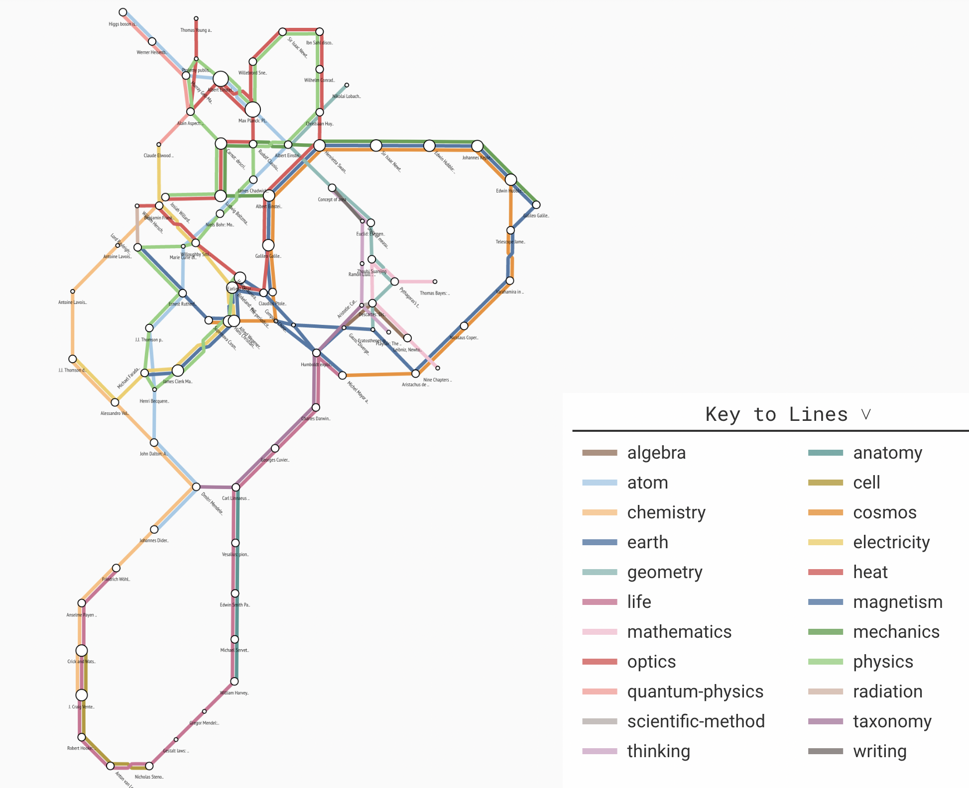
The first dataset was a timeline of “science”, which ended up being for most part the same thing as a timeline about light
If you found this remotely interesting, let me know! It is a topic I have been thinking about for some time now, and it would be interesting to have some feedback about it.
But I get we’ll see what fruits this tree bears every once in a while.
See you next week for VDS Digest,
Mathieu Guglielmino
Reply